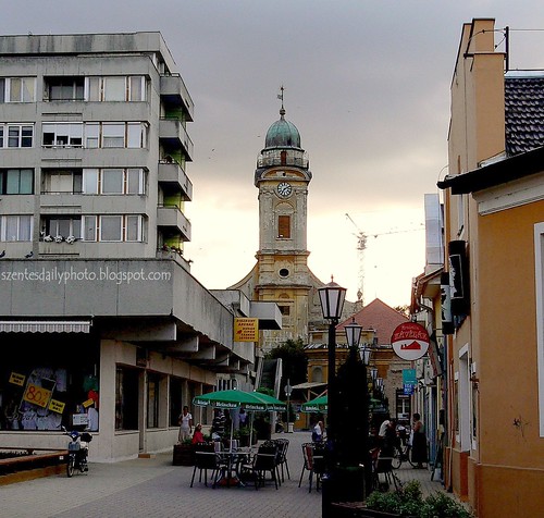
I have this love-hate feelings for buildings from the 60's-70's. Example in this photo, the 40 year-old building stick out like a sore thumb. The concrete colour is lifeless and in this instance, blocking the view of the evening sky. On the other hand, it once represented the future and making it part of our history. Finally, not forgetting, I was baby of that generation..
Note : Problem commenting? Try using the "other" or "anonymous" option to do so :)

13 comments:
I like where you put your DP logo on this photo. (I too don't care for the 60's/70's building.)
hi kris!! thanks for visiting...wow absolutely love the flowergirl photo...you're talented!! show us more of hungary! :> cheerios!
Kris, thanks for pushing the buttons this morning!
I can imagine how you feel about this building.
And yes creative cutting and pasting with the szentesdp logo!
this photo is thought provoking - it's very interesting how the right side of the photo looks pretty much colourful and the left gray - i always thought future (that is new stuff, new building) should look more appealing.
i like the way you captured old and new, interesting.
dutchie,
you're welcome. I'm glad there's no trouble in loggin in. shall push again on Monday midnighte then :)
meg,
yeah, with the logo there feels like the headquarters of my DP empire, right..hahahahaha
Enjoy your weekend everyone!
Placement of logo is quite amusing. The contrast of architectural styles is striking.
Hi Kris, nice having SDP advertisement on that building...quite a few mixed elements in this photo, the crane, the clock tower and the sore thumb ;-)
Kris, I love your thoughts about this shot. I see by the crane in the distance that the future is still coming your way. . . This is a wonderful shot for many reasons. My daughter was watching as the photo downloaded slowly from the top down. At first she said, "It's so gloomy, I wouldn't have taken a picture that day. Oh, now look at the colors showing up. Now it's a great shot!" It gave us a chance to talk about Europe, and how much older the history is, the layers of it one finds in any one city. She's young and never been off the North American contenent yet.
Hey, how do you put that logo onto your photo? I would like to know. Thanks.
-Kim
you are right, the building spoils the quaintness of this place.
Yes , I just had that same idea myself today in fact. I thought putting the web address in amusing places would be interesting.. I took a shot of a boat with 'Melbourne' written on it, I was going to add 'in photos.com' underneath. Well done , I look forward to more.
wah! so lansi now ah? you have your own building even!
well, if City Hall gave it a bit of a 'lift,' I'm sure it'll look great. Now it looks like no-one bothered to care for it.
edwin,
yeah, the town hall should wash it like the singaporean gov. does .
ps.i have one building in msia too. The FCW holding! my chinese initials ;)
John,
you should try a shot at the buzzling street full of signboard and place your web add. somewhere prominent, like the bill board? ;)
anyway, the placing was not deliberate ..just had no place to put it ;D
Kim,
You daughter can be a critics somedays ..hahah, I like how you described her impression of this photo. Say Thanks to her :)
I've sent you a private message via the DP forum. Hope you get the idea on how to insert text onto your photo :)
Luggi,
true. i see many in DP family showing similar building of the age. They all look depressing , really ..
Lisi,
ooh, SDP ..i like the sound of that ;)
Thank you all for stopping by :)
this is going to sound like a broken record, Kris...
but i really like where you placed your mark! a building all to yourself, huh??!! ;))
Post a Comment