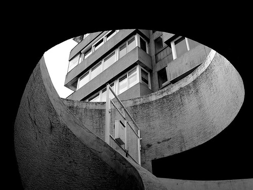
*beauty or ugly? is in the eyes of the beholder*
Majority of modern buildings here are from the 1960s. Can't say I like them design... but it was an era of renewal of life for the people and the town after a long halt since WWI&II*. It was then that the businesses start to flourish, all of which ensured the continuous development of our town.
correction : only WWI

15 comments:
hi - love the b&w picture! the ghana address is http://accradailyphoto.blogspot.com/
Hi Kris,
Nice shot and great composition. I thought everything in Hungary was state controlled in the 1960s, maybe I'm wrong?
Bob : you're right! the Soviets arrived in Szentes in the late 40s. Only in the 60s several companies were established. Which see more some development but of course at a slower speed :)
Andreea : thanks for the address :)
beautiful shot! I love 60s architecture. there's something about the lines and shapes that were used. controlled structure in a time of renewed human expression. where do these steps lead to? to the rostrum of the building above? to the basement?
Well done, you used well the power of image, yhis way everything looks pretty
Beautiful angle. Your images are absolutely amazing day after day :)
Edwin : That's a 2 separate buildings actually ;) i do prefer the lines and clean design of the 60s ; however some have weirdly designed features..
Thank you all for stopping by :)
Mnnn now I can see the original size of photos ...coool
That is a great shot from below, using the shape of the stairwell to frame the building.
Great angle and great shot!
Hi Kris, I've browsed some of your photos in flickr and they are GREAT shots and professional standard flowers and food photos!
Lisi : thank you for taking the time :) I'm just playing with the camera
Thank you all for dropping by :)
Nice geometric shapes and shades of grays
I like the lines also and in b/w, it is intriguing and beautiful. I like your angle.
Super shot!
Post a Comment